Interview Data Visualization: A Guide for Researchers

TL;DR:Interview data visualization converts coded qualitative data into visual formats that reveal patterns and support clear communication. It enhances analysis by making recurring themes and relationships quickly understandable, reducing interpretation time. Incorporating AI tools streamlines the workflow, but human judgment remains essential for validating insights and maintaining traceability.
Interview data visualization is defined as the process of converting qualitative interview transcripts, coded themes, and participant responses into visual formats that make patterns and insights immediately clear. For data analysts and researchers, this practice sits at the intersection of qualitative rigor and communicative clarity. Methods like theme maps, Sankey diagrams, code trees, and timeline charts each serve distinct analytic purposes. Visualization reduces cognitive overload by synthesizing large, text-heavy datasets into digestible summaries that speed stakeholder communication. As AI tools mature through 2026, the gap between raw interview data and publishable insight continues to narrow.
What is interview data visualization, and why does it matter?
Interview data visualization is the structured translation of qualitative data into graphics that reveal what text alone cannot. A researcher reading 12 transcripts manually will struggle to see which themes recur across participants. A well-built theme map or code tree makes those patterns visible in seconds.
The industry term for the broader practice is qualitative data visualization, and it encompasses several established formats. Word clouds show term frequency at a glance. Sankey diagrams trace flows between categories, such as how participants moved from a stated problem to a coping behavior. Code trees display hierarchical relationships between parent and child themes. Treemaps show proportional weight of each theme across a dataset. Timeline charts plot how participant experiences shifted over time.
Each format answers a different research question. Choosing the wrong format for your question is one of the most common errors in interview data analysis. A word cloud tells you what words appeared often. It does not tell you what those words meant to participants or how they connected to each other.
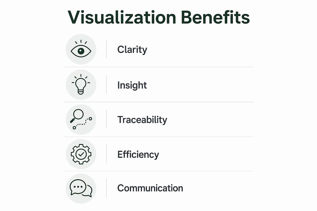
The benefits of interview data visualization are concrete. Clarity improves because visual formats remove ambiguity from written summaries. Speed increases because patterns that take days to identify in text emerge in hours from a well-structured chart. Interpretability rises because stakeholders who were not present during data collection can still understand findings. Communication improves because visuals translate across teams, disciplines, and organizational levels.
What are common methods and tools used for visualizing interview results?
The most widely used visualization types in qualitative research each carry specific strengths.
- Word clouds work best for exploratory overviews. They surface dominant language quickly but carry no structural information.
- Sankey diagrams map flows and transitions. Funnel structures like Sankey diagrams allow researchers to diagnose conversion patterns with as few as 20 data points, making them useful even in small-sample qualitative studies.
- Theme maps show relationships between codes and categories. They are the standard output of thematic analysis frameworks like Braun and Clarke’s six-phase model.
- Code trees display hierarchical coding structures. They are particularly useful in grounded theory and framework analysis.
- Treemaps represent proportional theme weight across a dataset. They work well when comparing theme prevalence across participant subgroups.
- Timeline charts plot participant experiences chronologically. They are standard in narrative inquiry and longitudinal interview studies.
On the tools side, the range runs from general to specialized. Spreadsheet applications like Excel and Google Sheets handle basic frequency charts and bar graphs. QDA software like NVivo supports code grouping, thematic mapping, and pattern detection within a single platform. AI-enabled platforms automate initial coding, theme clustering, and visual output generation, cutting processing time significantly.
Manual visualization requires a researcher to code transcripts, group codes into themes, and then build visuals by hand. AI-assisted tools reduce synthesis time from 1–5 days for 5–15 transcripts down to a matter of hours. That time saving matters most when research timelines are tight or when iterative rounds of interviews are running in parallel.

Pro Tip: Select your visualization method before you begin coding, not after. Your research question determines the right visual format. If you are mapping flows between behaviors, plan for a Sankey diagram from the start. If you are building a hierarchical coding structure, design your code tree as you code.
How does interview data visualization enhance qualitative analysis?
Visualization accelerates pattern detection in ways that manual reading cannot match. A researcher reviewing 20 transcripts line by line will take days to identify which themes appear together, which contradict each other, and which are unique to one participant subgroup. A theme map built from the same data surfaces those relationships in one view.
One distinction that visualization makes concrete is the difference between themes and insights. Theme categorization organizes interview data, but insights are the actionable interpretations that drive decisions. A theme map might show that “communication breakdown” appeared in 14 of 20 interviews. The insight is that communication breakdown occurs specifically at handoff points between teams, not during project execution. Visualization that stops at theme frequency misses the decision-relevant finding.
“The hybrid AI-human model is the gold standard for modern interview data visualization. AI excels at pattern recognition and speed. Human analysts are essential for interpreting emotional nuance and social context.” — How to Analyze Customer Interview Data
Cognitive overload is a real constraint in qualitative research. Analysts working through dense transcripts lose track of earlier findings as new data accumulates. Visual summaries function as working memory aids. They let researchers hold the full dataset in view while drilling into specific segments.
Effective visualization maintains traceability of insights back to original participant quotes and transcript segments. This traceability is what makes qualitative findings defensible. A stakeholder who questions a finding can follow the visual back to the verbatim quote that generated it. Without that chain, visualization becomes assertion rather than evidence.
What are key considerations and best practices when visualizing interview data?
The first choice is whether your research is inductive or deductive. Deductive visualization approaches align best with hypothesis validation, while inductive methods suit exploratory research. Using a deductive framework on exploratory data forces findings into predetermined categories and produces misleading visuals.
A specific risk in Sankey diagrams deserves attention. Ghosted applications cause noise in funnel visualizations, and the same principle applies to interview data. If a participant gave no response to a question, that non-response must be explicitly categorized. Leaving it uncategorized distorts the flow diagram and produces conclusions that do not reflect the actual dataset.
Five best practices for effective interview data visualization:
- Align your visual format with your research question. Do not choose a word cloud for a study that requires relational mapping.
- Maintain traceability from every visual element back to raw data. Every theme node should link to the quotes that generated it.
- Categorize non-responses and ambiguous data explicitly. Uncategorized data creates noise that distorts visual outputs.
- Validate AI-generated visuals with human review. AI accelerates coding but requires human judgment to catch misclassifications and missed nuance.
- Iterate your visuals as analysis deepens. The first version of a theme map is a hypothesis. Refine it as you move through axial coding and thematic grouping.
| Consideration | Risk if ignored | Recommended action |
|---|---|---|
| Inductive vs. deductive alignment | Forced categorization, misleading findings | Define analytic approach before coding begins |
| Non-response categorization | Noise in funnel and flow diagrams | Create an explicit “no response” category |
| Traceability to raw data | Indefensible findings | Link every visual element to source quotes |
| Human validation of AI outputs | Missed nuance, misclassification | Schedule a review pass after AI coding |
Pro Tip: Build your visualization for your audience, not for yourself. A theme map that makes sense to a qualitative researcher may confuse a product team. Simplify the visual layer for stakeholder presentations while keeping the full analytic version for your own records.
How to practically implement interview data visualization
A repeatable workflow for visualizing interview results runs through six stages.
- Transcription. Convert audio or video recordings to text. AI transcription tools handle this in minutes per interview. Manual transcription takes 3–4 hours per hour of audio.
- Open coding. Read each transcript and assign descriptive labels to meaningful segments. This is the most time-intensive manual stage. AI tools generate initial code sets automatically, which researchers then review and refine.
- Axial coding. Group open codes into categories based on relationships. This is where the structure for your eventual theme map or code tree begins to take shape.
- Thematic grouping. Identify overarching themes from your code categories. At this stage, you are building the architecture of your visualization.
- Visualization. Build your chosen visual format using your thematic structure. Select the format that best answers your research question.
- Insight synthesis. The most labor-intensive phase is synthesizing insight statements from coded themes. AI accelerates this step but requires human validation to produce defensible findings.
For reporting, tailor the visual format to the output channel. A journal article calls for a static theme map with a detailed caption. A stakeholder presentation calls for a simplified version with callout quotes. An internal research repository benefits from interactive visuals that let readers drill into specific themes.
AI-enabled platforms that support interview insights visualization can cut the full workflow from days to hours. The time saving is largest in the open coding and thematic grouping stages, where AI handles the first pass and humans handle validation.
Key Takeaways
Interview data visualization converts qualitative interview data into visual formats that reveal patterns, support defensible findings, and communicate insights to stakeholders faster than text analysis alone.
| Point | Details |
|---|---|
| Definition is specific | Interview data visualization converts coded qualitative data into structured visual formats, not just charts of numbers. |
| Format choice drives validity | Selecting the wrong visual type for your research question produces misleading findings, not just aesthetic problems. |
| AI accelerates but does not replace | AI cuts synthesis time from days to hours, but human review remains required for nuance and defensibility. |
| Traceability is non-negotiable | Every visual element must link back to the original participant quote for findings to hold up to scrutiny. |
| Insights outrank themes | Visualizations that stop at theme frequency miss the decision-relevant layer that drives real action. |
Why visualization is the skill qualitative researchers underinvest in
I have reviewed qualitative research reports from analysts at every level, and the pattern is consistent. The coding is thorough. The thematic analysis is defensible. The visualization is an afterthought, usually a word cloud dropped into a slide deck with no connection to the analytic structure underneath it.
That disconnect is costly. A stakeholder who sees a word cloud does not understand what the researcher found. They see words. The researcher spent weeks building a nuanced thematic structure, and the visual communicates none of it.
The shift I have seen work is treating visualization as part of the analytic process, not the presentation layer. When you build your theme map during axial coding rather than after the report is written, the visual becomes a thinking tool. It shows you gaps in your coding structure. It reveals relationships you missed in the text. It makes your analysis better, not just more presentable.
The hybrid AI and human model is where the field is heading, and for good reason. AI handles the volume problem. Humans handle the meaning problem. The researchers who will produce the best work in 2026 are the ones who know how to direct AI tools toward the right questions and then apply judgment to the outputs.
The one mistake I see most often from researchers new to AI-assisted visualization is trusting the first output. AI-generated theme clusters are a starting point. They reflect statistical patterns in language, not the interpretive depth that comes from actually listening to participants. Always treat the AI output as a draft, not a finding.
— Jure
How Parakeet-ai fits into your interview analysis workflow
Qualitative researchers who want to move faster from raw interview data to clear visual findings have a practical option in Parakeet-ai.
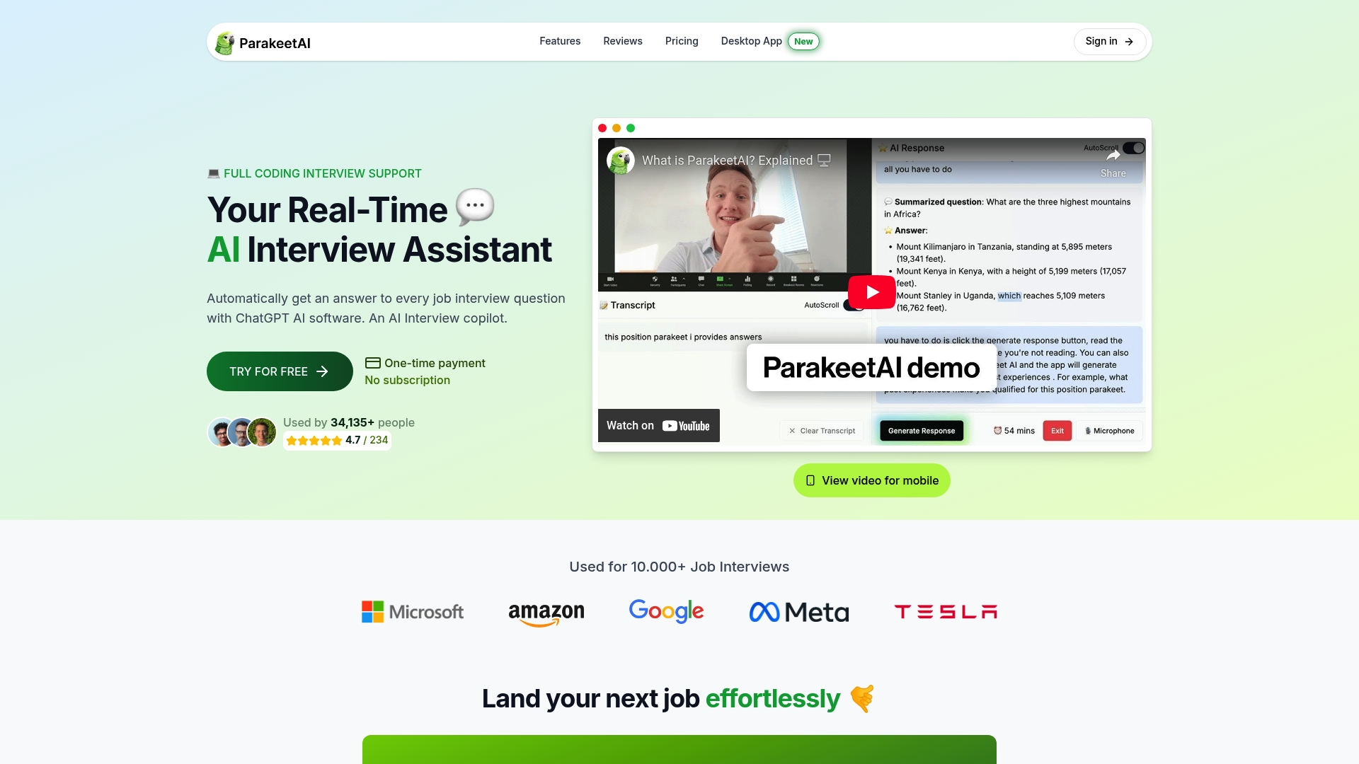
Parakeet-ai is a real-time AI interview assistant that listens to interviews and automatically generates responses and structured outputs from every question. For researchers, that means less time on manual transcription and initial coding, and more time on the interpretive work that produces real insight. The platform supports the kind of AI-assisted interview analysis that makes hybrid human and AI workflows practical at scale. If your current process involves days of manual synthesis, Parakeet-ai is worth a close look.
FAQ
What is interview data visualization in qualitative research?
Interview data visualization is the process of converting qualitative interview transcripts and coded themes into visual formats like theme maps, Sankey diagrams, and code trees. These visuals make patterns, relationships, and insights easier to identify and communicate than text analysis alone.
What types of visuals work best for interview data?
Theme maps, code trees, and Sankey diagrams work best for relational and structural analysis. Word clouds suit exploratory overviews, while timeline charts fit narrative and longitudinal studies.
How does AI improve interview data visualization?
AI reduces the time to synthesize 5–15 interview transcripts from 1–5 days to a matter of hours by automating initial coding and theme clustering. Human review remains required to validate outputs and interpret emotional and social nuance.
What is the difference between a theme and an insight in visualization?
A theme is a recurring category in your data, such as “communication breakdown.” An insight is the actionable interpretation of that theme, such as breakdowns occurring specifically at team handoff points. Effective visualization surfaces insights, not just theme frequency.
Why does traceability matter in interview data visualization?
Traceability links every visual element back to the original participant quote that generated it. Without that link, qualitative findings cannot be verified or defended, which undermines the credibility of the entire research output.